Industry
Retail
Services
- UX Audit & Competitor Benchmarking
- Accessibility Review
- Wireframing
- UI Design (Mobile & Desktop)
- eCommerce Development
- Woocommerce Development
- Woocommerce Integrations
- Hosting
Website
Modernising Ordering & Operations for a Leading Timber Supplier
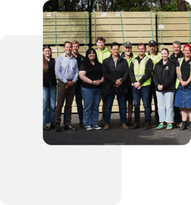
Narangba Timbers is a well-established Queensland-based timber supplier servicing builders, contractors, and trade customers across Australia.
As the business grew, manual quoting processes, fragmented ordering workflows, and limited search functionality began slowing down operations. Their previous setup made it difficult for customers to quickly find products, request quotes, or understand pickup and delivery options, while internal teams relied heavily on manual handling and phone/email coordination.
Narangba engaged EUX Digital to redesign and rebuild their WooCommerce platform with a focus on:
- Streamlining trade ordering
- Improving product discoverability
- Reducing manual admin workload
- Connecting eCommerce with operational systems
The result is a scalable B2B and B2C focused WooCommerce platform that supports real-world warehouse and trade workflows, not just online browsing.
Goals
01
Improve UX for trade customers searching across complex timber categories
02
Reduce manual quoting and phone-based ordering
03
Implement structured pickup and delivery logic
04
Integrate MYOB invoicing for operational alignment
05
Create warehouse-friendly tools to support fulfilment efficiency
06
Future-proof the platform for scale and automation
Phase 1: UX & Competitor Audit
Audit & Challenges
We began with a structured UX review of the existing website and competitor landscape within the building materials industry.
This included:
- Heuristic analysis of search and filtering workflows
- Review of trade-focused B2B timber suppliers
- Identification of friction in quote-based purchases
- Evaluation of mobile usability for onsite builders
- Audit of product taxonomy and attribute structure
These insights informed a rebuild focused on structured data, intelligent filtering, and trade-specific ordering flows.
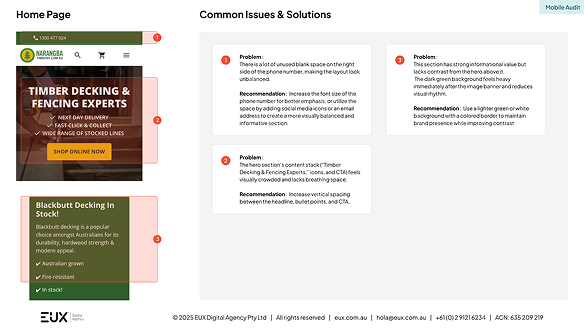
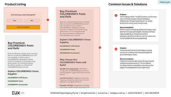
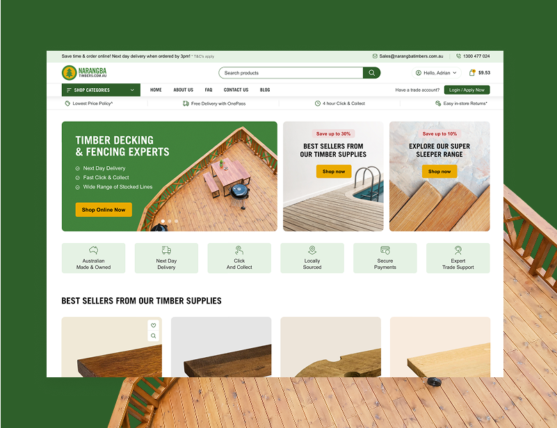
Problem :
The hero section’s content stack (“Timber Decking & Fencing Experts,” icons, and CTA) feels visually crowded and lacks breathing space.
Recommendation : Increase vertical spacing between the headline, bullet points, and CTA.
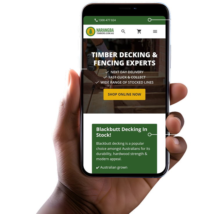
Problem :
There is a lot of unused blank space on the right side of the phone number, making the layout look unbalanced.
Recommendation : Increase the font size of the phone number for better emphasis, or utilize the space by adding social media icons or an email address to create a more visually balanced and informative section.
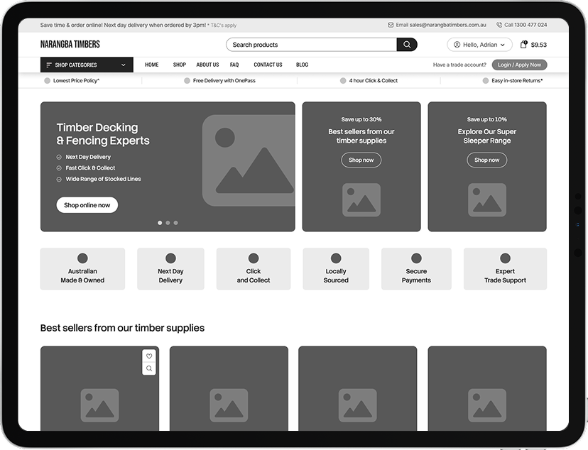
Problem :
This section has strong informational value but lacks contrast from the hero above it.
The dark green background feels heavy immediately after the image banner and reduces visual rhythm.
Recommendation : Use a lighter green or white background with a colored border to maintain brand presence while improving contrast
01Problem :
The hero section’s content stack (“Timber Decking & Fencing Experts,” icons, and CTA) feels visually crowded and lacks breathing space.
Recommendation : Increase vertical spacing between the headline, bullet points, and CTA.
02Problem :
There is a lot of unused blank space on the right side of the phone number, making the layout look unbalanced.
Recommendation : Increase the font size of the phone number for better emphasis, or utilize the space by adding social media icons or an email address to create a more visually balanced and informative section.
03Problem :
This section has strong informational value but lacks contrast from the hero above it.
The dark green background feels heavy immediately after the image banner and reduces visual rhythm.
Recommendation : Use a lighter green or white background with a colored border to maintain brand presence while improving contrast
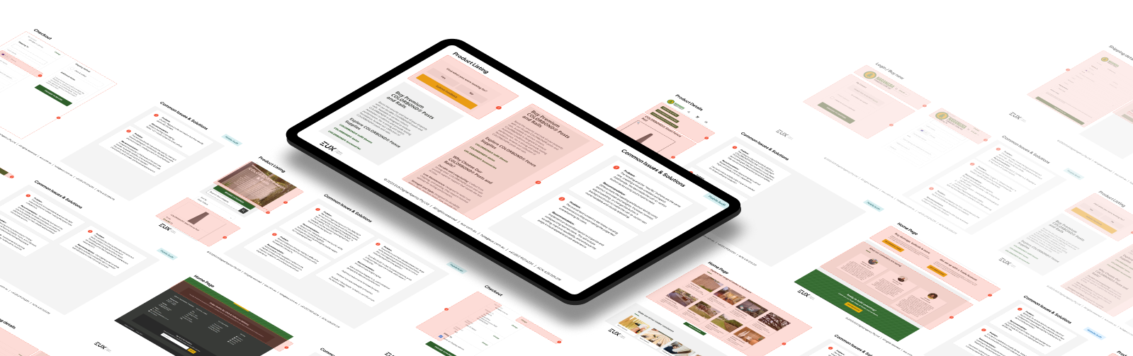
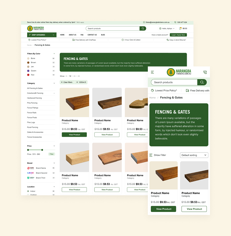
Phase 2: Wireframing
Designing Around Trade Efficiency
With insights validated, we created structured wireframes prioritising:
- Simplified navigation for large product ranges
- Intelligent search and attribute-based filtering
- Clear “Request a Quote” pathways
- Structured pickup and delivery selection flows
- Streamlined cart experience for bulk orders
Wireframes were reviewed collaboratively with the Narangba team to ensure real-world warehouse and trade scenarios were reflected in the design.
Low Fidelity Wireframes

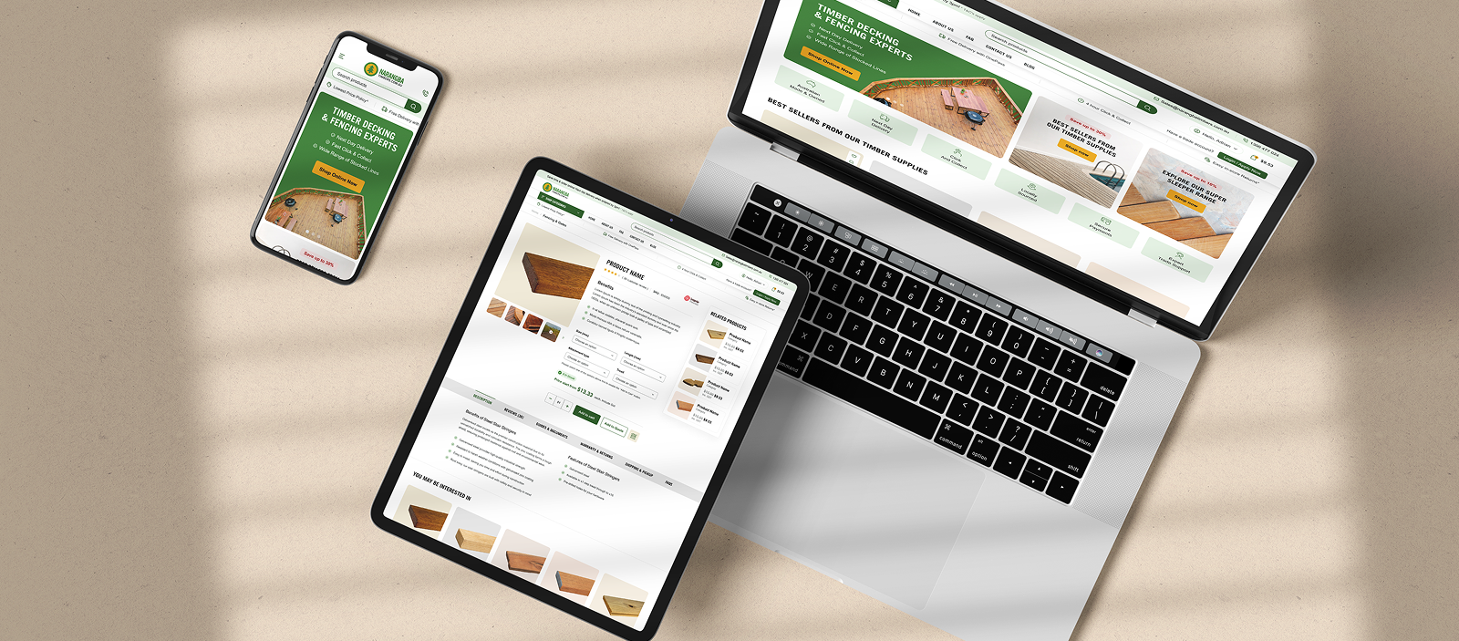
Phase 3: UI & Graphic Design
Clarity, Functionality & Brand Alignment
The UI phase focused on building a clean, trade-oriented interface that balanced usability with brand strength.
We delivered:
- Mobile-first responsive layouts
- Clear category hierarchy and mega menu structure
- Strong CTAs for quote requests
- Structured product presentation for bulk and specification-based buying
- Consistent visual treatment across collections and custom pages
The final design supports high-volume trade purchasing while remaining intuitive and accessible.

Phase 4: WooCommerce Development
Operationally Aligned eCommerce Architecture
The development phase focused heavily on functionality and backend alignment.
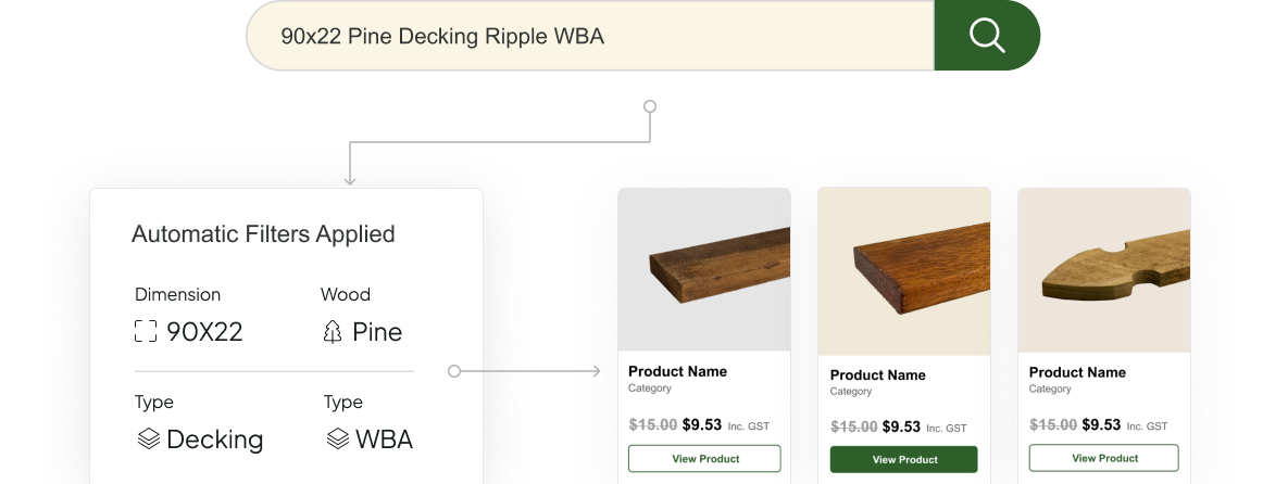
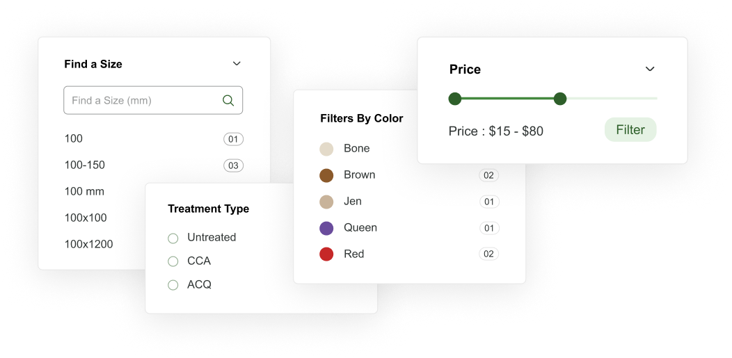
Search bar with automatic attribute selection
We built an intelligent search system that recognises timber attributes such as size,
treatment type, colour, and brand, automatically applying filters in real time.
This dramatically improves product discovery speed for trade customers.
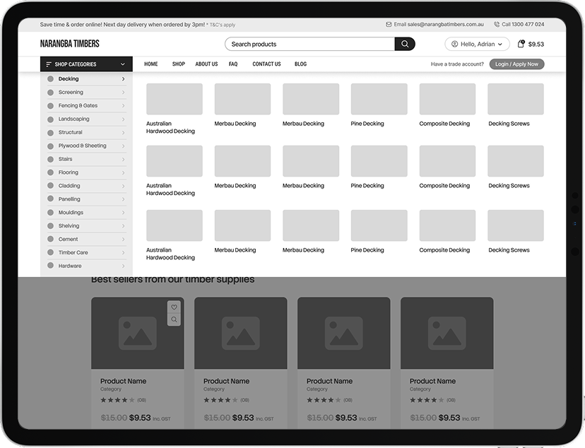
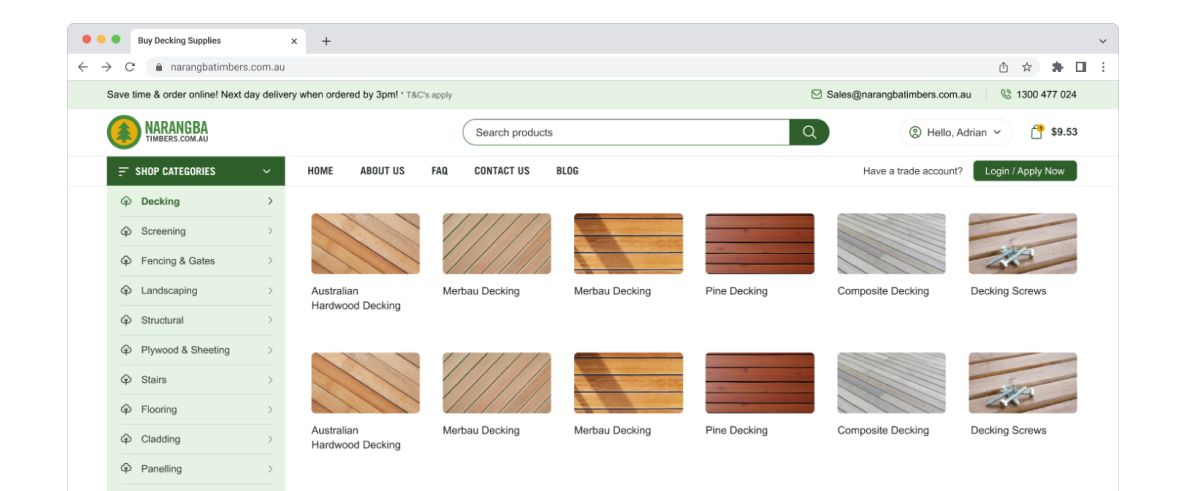
Megamenu
A structured mega menu was implemented to organise Narangba’s extensive catalogue by real trade buying logic.
This enables fast, intuitive navigation across complex product ranges.
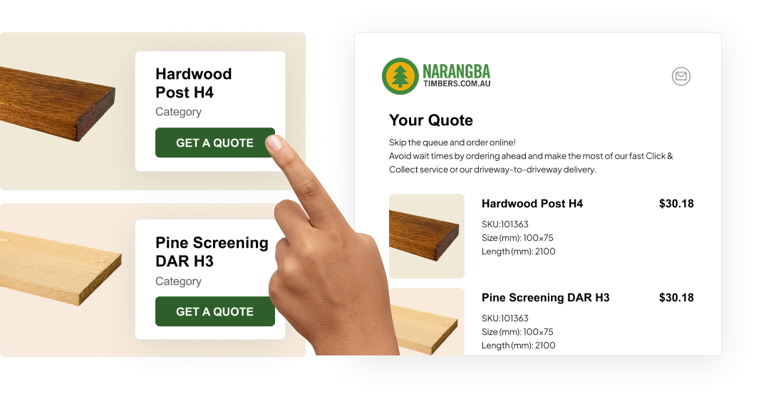
Request a Quote
We developed a streamlined Request a Quote flow that replaces manual email handling
with a structured digital process. This improves data accuracy, response time, and
internal efficiency.
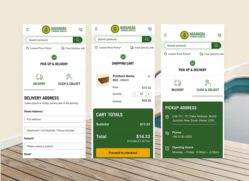
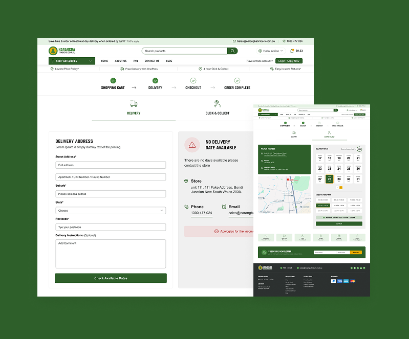
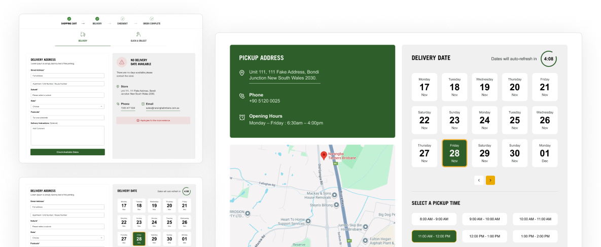
Pickup and delivery system
A custom pickup and delivery logic layer aligns online ordering with real-world warehouse operations.
Customers can select delivery zones or pickup options with clear availability visibility.
Myob Invoices

WooCommerce was integrated with MYOB to align online orders with accounting workflows.
This ensures structured invoice visibility and reduces manual reconciliation.
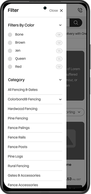
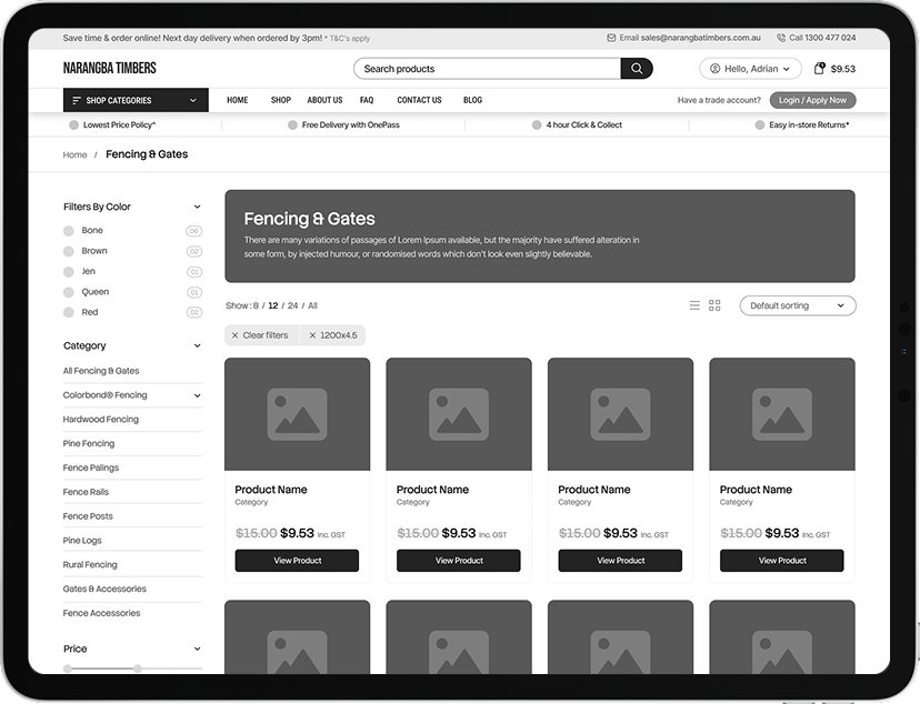
Custom Shop Filters
(color, treatment type, size, brand)
Advanced filtering by colour, treatment type, size, and brand allows trade customers to quickly narrow results.
This mirrors how professionals search for timber specifications in practice.
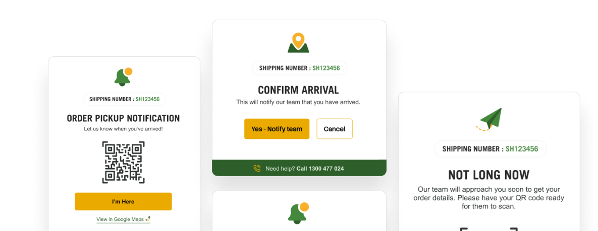
Collections Page
A custom QR-based collections page allows warehouse staff to scan orders and instantly view fulfilment details.
This improves dispatch speed and reduces handling errors.
12%
Increase in ROI
8%
Increase in Sales
-30%
Bounce Rate
“It is a long established fact that a reader will be distracted by the readable content of a page when looking at its layout “
Daniel Kirsten
CEO Narangba